Videos
Video in email can be an effective way to show how your products or services work, as well as add personality to your brand.
The following example from Wistia uses an embedded video in email.
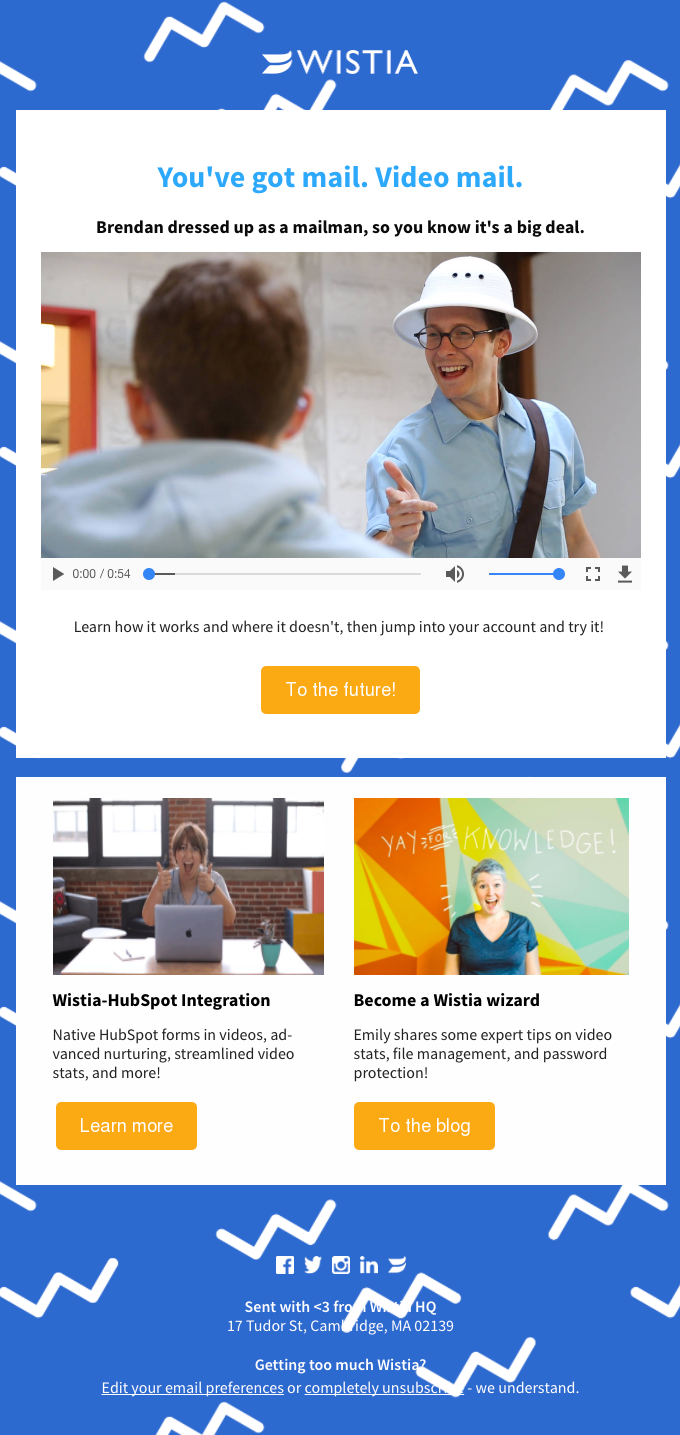

One caveat with video: It’s not supported everywhere. If you add a video to your next email, make sure to include a good fallback. The above example from Wistia uses a thumbnail fallback for non-supported clients.
(Want to learn more? We cover the ins and outs of video in email here).
Polls
Polls are a great way to get a quick pulse check on what your subscribers really want. It’s a low-stakes opportunity to learn more about your audience, plus an engaging way to add interactivity to your emails.
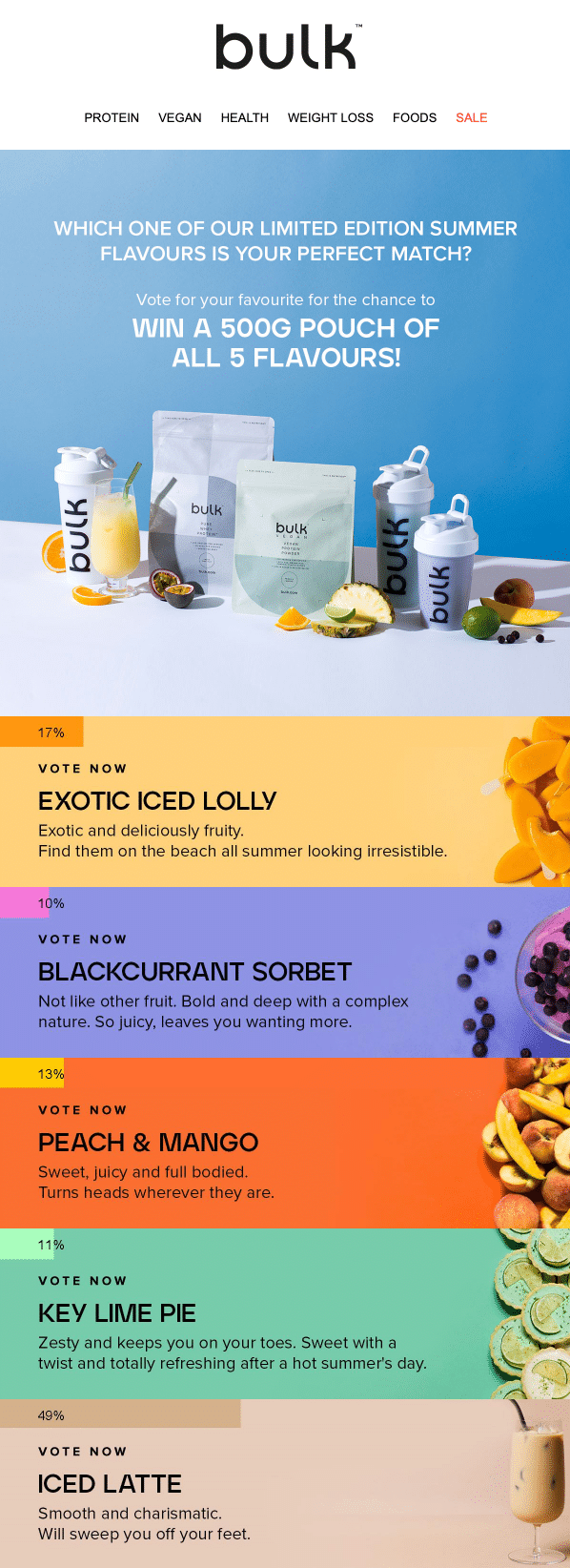
The below example from Bulk uses live polling to collect real-time interest indicators. As subscribers open and click through, the votes update. Recipients can revisit the email to see live poll results. Additionally, the click data captured from live polls can be used as more data points for more personalization. Win-win!

Add to cart
Add-to-cart functionality lets subscribers go through their options before clicking through to make their payment. This removes the need to click through to a landing page, creating a more seamless checkout process.
Below is an example of an add-to-cart email from Google. Subscribers can toggle between color selections before adding the product to their cart.
Source: Really Good Emails
Opportunities and challenges with interactive emails
With the examples above, we’ve only scratched the surface with the possibilities of interactivity in email. Other types of interactive email elements include:
- Tabbed content
- Hamburger menus
- Hot spots
- Quizzes
- Anchor tags
- Forms or radio button selection
- Accordions
- Offer reveals
- Review and rating submissions
- Search bar entries
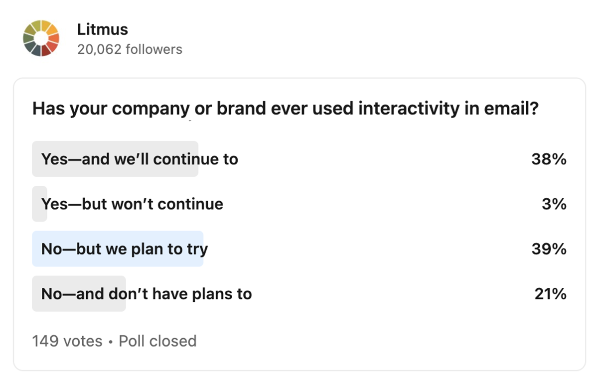
With such a wide variety of elements, the future of interactive email looks bright. When we asked our audience on LinkedIn whether or not they’re using it in their emails, 38% answered “Yes—and we’ll continue to.” The most common response to whether or not an email marketer has used interactivity was “No, but we plan to try,” with 39% of responses.
Let’s take a look at what’s holding so many marketers back.
Interactivity may seem intimidating (or frivolous)
Coding an interactive email design may be intimidating. Email service provider (ESP) support for different interactive elements has varied over the past few years, which might make designers shy away from implementing interactivity.
We suspect that email marketers may also view interactivity as a tactic reserved for the biggest companies and “best” email developers. It doesn’t help that most of the current examples are from well-known companies. If an email marketer heads to Really Good Emails’ interactive email examples, they would see Xfinity, Taco Bell, Adidas, BBC, and more. If you look a bit closer at the examples from household names, like the one from the BBC below, you might notice that not all interactivity is overly intricate. This email doesn’t have a bunch of different effects or elements at play.


Some email marketers may also view interactivity as a bit frivolous. In email games and quizzes, like Taco Bell’s holiday maze, there’s an undeniable element of fun.


In the grand scheme of all the tasks an email marketing team needs to tackle, it might not seem worth it to learn a new skill for one email a year. Perhaps email interactivity will become more widespread when companies begin to use various elements in the emails they regularly send.
The bottom line? Interactive emails don’t have to be scary–and they don’t have to be used only by large companies.
Where should curious email developers start?
The first place beginner interactive email developers can start is with hover effects. Adding a hover effect to an email element, such as a link or image, makes the email more engaging and indicates clickability. You can add hover effects to nearly every aspect of the email, from text to images to buttons.
Another place to start is with email accessibility. An estimated 1.3 billion people live with visual impairment, and interactive elements such as high contrast switchers make sure every customer can enjoy your emails. In a past newsletter of ours (which you can interact with here), our email team adapted Paul Airy’s accessibility switcher to create a fully interactive email, featuring switchers and hover effects. If you want to try out these effects on your own emails, Alice Li teaches you how in this Litmus Community post.
Interactivity is common on websites and apps, but this popular design trend isn’t yet widespread in email marketing. Some teams have experience with it, but there are still plenty who’ve yet to commit. If you’ve been putting off giving interactivity a try, you’re not alone. Here are some great resources to help you get started with using interactive elements in your emails:

