
Big Data Visualization: Use Cases and Techniques
From our 8-year experience in providing big data services, dashboard design seems to be the most underestimated. Unfortunately, not all the companies share the thinking of Rolls-Royce that believes visualizing big data is as important as manipulating it. Most often, companies don’t realize how much these fancy graphs and charts contribute to making informed decisions until they have to find some valuable insights within seconds among the millions of data records.
Big data visualization makes a difference
John Tukey, a celebrated mathematician and researcher, once said: “The greatest value of a picture is when it forces us to notice what we never expected to see.” And our data visualization team couldn’t agree more. Visualization allows business users to look beyond individual data records and easily identify dependencies and correlations hidden inside large data sets.
Here go examples of how big data analysis results can look with and without well-implemented data visualization.
Example 1: Analysis of industrial data
In some cases, the maintenance team can skip the ‘looking for insights’ part and just get notified by the analytical system that part 23 at machine 245 is likely to break down.
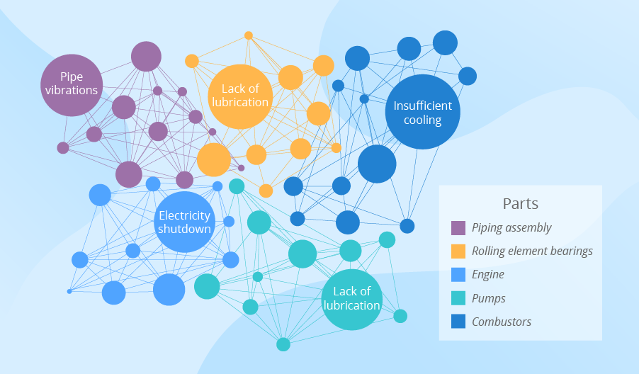
Nevertheless, the maintenance team is unlikely to be satisfied with instant alerts only. They should be proactive, not just reactive in their work, and for that, they need to know dependencies and trends. Big data visualization helps them get the required insights. For example, if the maintenance team would like to understand the connections between machinery failures and certain events that trigger them, they should look at connectivity charts for insights.
Example 2: Analysis of social comments
Imagine a retailer operating nationwide. One customer may visit their store and post on Facebook: “Guys, if you haven’t bought Christmas presents yet, go to [the retailer’s name].” Another customer may share on Twitter: “I hate New Year time! I’ve never seen lines that long! I wasted an hour at [the retailer’s name] today. And the staff was rude. Hate this place!” The third customer may post on Instagram: “Look what a gorgeous reindeer sweater I bought at [the retailer’s name]!”
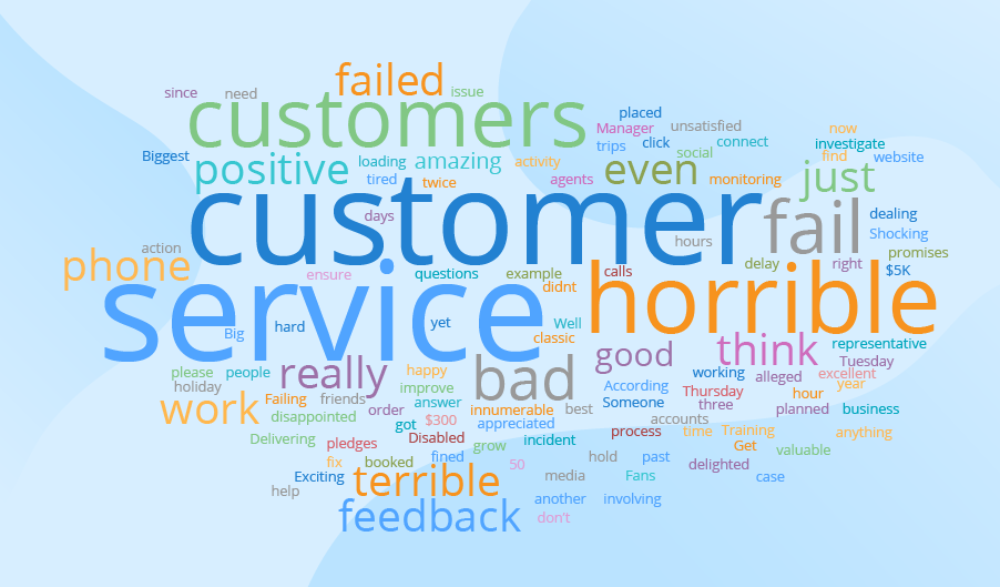
The company’s customer base is 20+ million. It would be impossible for the retailer to browse all over the internet in the search of all the comments and reviews and try to get insights just by scrolling through and reading all the comments. To have these tasks automated, companies resort to sentiment analysis. And to get instant insights into the analysis results, they apply big data visualization. For example, word clouds demonstrate the frequency of the words used. The higher the frequency, the bigger a word’s font. So, if the biggest words are hate, awful, terrible, failed, and their likes – it’s high time to react.
Example 3: Analysis of customer behavior
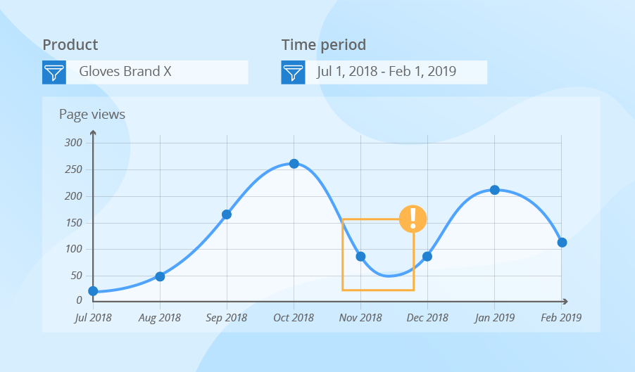
Companies use a similar scenario to analyze customer behavior. They strive to implement big data solutions that would allow gathering detailed data about the purchases in brick-and-mortar and online stores, browsing history and engagement, GPS data and data from the customer mobile app, calls to the support center and more. Registering billions of events daily, a company is unable to identify the trends in customer behavior if they have just multiple records at their disposal. With big data visualization, ecommerce retailers, for instance, can easily notice the change in demand for a particular product based on the page views. They can also understand the peak times when visitors make most of their purchases, as well as look at the share of coupon redemption, etc.
Most frequently used big data visualization techniques
Earlier, we studied on practical examples how companies can benefit from big data visualization, and now we’ll give an overview of the most widely used data visualization techniques.
Symbol maps
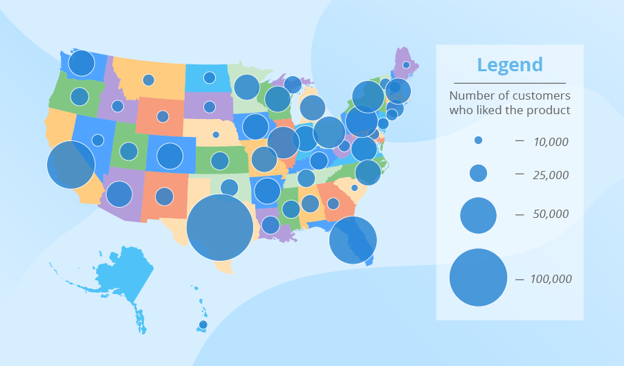
The symbols on such maps differ in size, which makes them easy to compare. Imagine a US manufacturer who has launched a new brand recently. The manufacturer is interested to know which regions liked the brand particularly. To achieve this, they can use a map with symbols representing the number of customers who liked the product (left a positive comment in social media, rated a new product high in a customer survey, etc.)
Line charts
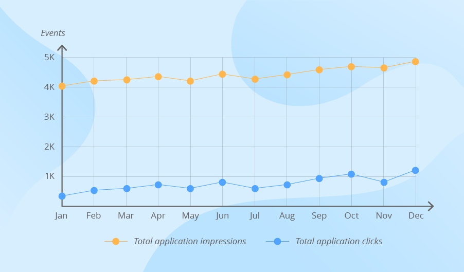
Line charts allow looking at the behavior of one or several variables over time and identifying the trends. In traditional BI, line charts can show sales, profit and revenue development for the last 12 months. When working with big data, companies can use this visualization technique to track total application clicks by weeks, the average number of complaints to the call center by months, etc.
Pie charts
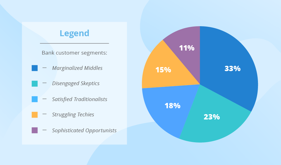
Pie charts show the components of the whole. Companies that work with both traditional and big data may use this technique to look at customer segments or market shares. The difference lies in the sources from which these companies take raw data for the analysis.
Bar charts
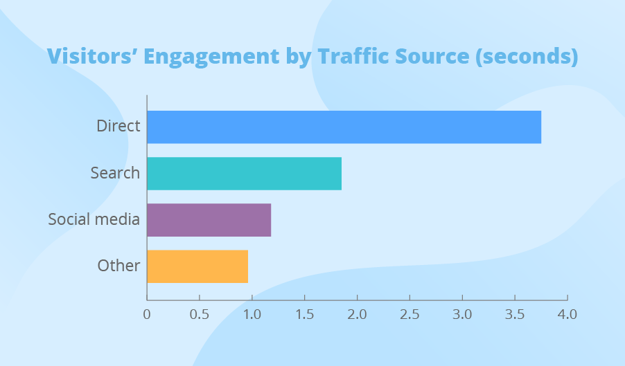
Bar charts allow comparing the values of different variables. In traditional BI, companies can analyze their sales by category, the costs of marketing promotions by channels, etc. When analyzing big data, companies can look at the visitors’ engagement with their website’s multiple pages, the most frequent pre-failure cases on the shop floor and more.
Heat maps
Heat maps use colors to represent data. A user may encounter a heat map in Excel that highlights sales in the best performing store with green and in the worst performing – with red. If a retailer is interested to know the most frequently visited aisles in the store, they will also use a heat map of their sales floor. In this case, the retailer will analyze big data, such as the data from a video surveillance system.

How to avoid mistakes related to big data visualization?
The main purpose of big data visualization is to provide business users with insights. Choosing the right visualization tool among the variety of options on the market (Microsoft Power BI, Tableau, QlikView, and Sisense are just a couple of product names) and applying the right techniques to create uncluttered and intuitive dashboards may appear to be a more complicated task than it seems. If you feel that you need any assistance with this issue, you can involve big data consultants to help you choose the most suitable visualization solution and/or customize it.
Data visualization is key to clear-cut reports and dashboards. Do you want to have all the insights recognized at a glance? We know how to do it.