When analyzing data, it’s essential to avoid drawing conclusions from too few data points. This principle is crucial whether you’re looking at TV ratings, business metrics, or Olympic viewership statistics.
Two data points are not a trend.

Let’s start with an example from a recent LinkedIn headline that caught my eye: “Olympics audience biggest since ’12.” This statement is factually correct but doesn’t tell the whole story. To understand the real trend, we need more than just two data points.
There’s always one data point in a set that’s “biggest.” That doesn’t mean it’s a statistically meaningful difference.

“Olympics audience biggest since ’12” is a true, factually correct statement. But what would the IOC, NBC, and international broadcast partners do with that information?
To identify meaningful trends, we need a series of data points. A run chart, which plots data points in time order, can help visualize this. Even better, a Process Behavior Chart (PBC) can distinguish between normal variation and significant changes.
Is there really a trend over time? Or are the viewership numbers just fluctuating around a stable average?
Here’s a quick primer on these tools:
- Run Chart: A line graph showing data points over time. It helps visualize trends and patterns.
- Process Behavior Chart (PBC): Adds statistical limits to a run chart, helping to identify when a data point is part of a stable process or a signal of change.
From this article, we find another data point and longer-term comparison:
“The Tokyo Summer Games in 2021 drew just 17.9 million viewers for its opening ceremony, a 33-year low.”
Every data set also has a “lowest number ever.”
Now we know viewership increased from 17.9 million (2021) to 29 million (2024) for the opening ceremonies. Is that statistically meaningful? I don’t know from two data points. That sounds like a huge leap, but how much does it normally fluctuate? We need more data.
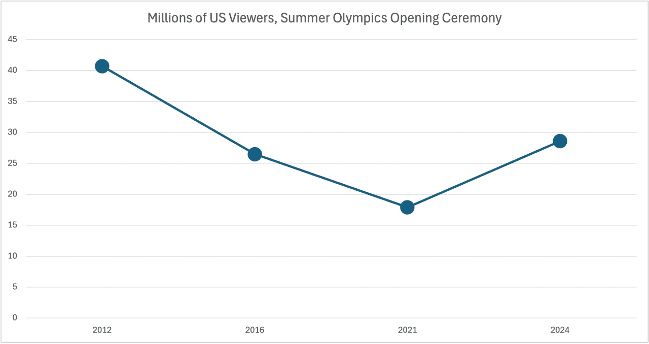
This article says 2012 was 40.7m. Again, four data points is not a trend.
Here’s a run chart of the last four Summer Olympics opening ceremonies that shows more of an accurate picture (without needing a full Process Behavior Chart methodology):
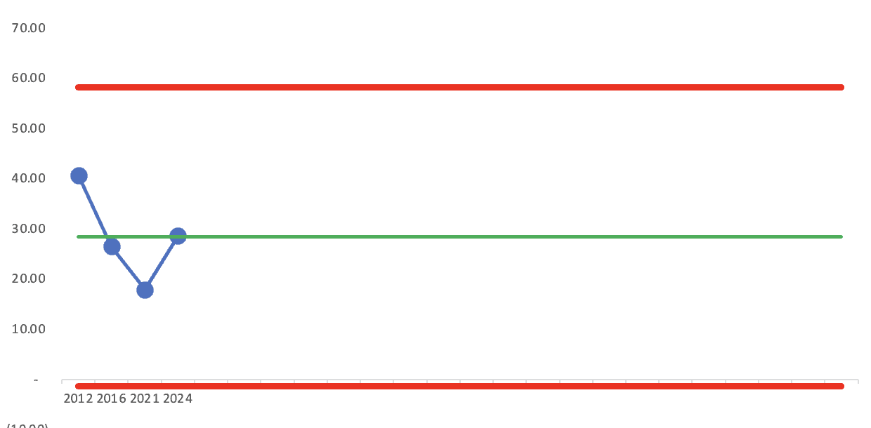
As I was taught by the statistician Donald J. Wheeler, the bare minimum for creating a Process Behavior Chart is FOUR data points. This is controversial to some. Wheeler would correctly warn that the limits are very uncertain when we have only four data points. It’s better to have 10, 15, 20, or 25 data points. You get diminishing returns in the accuracy of the limits as you add more data points to the calculations of the average and limits.
But here is the four-data-point PBC, which tells us that all of these data points are just “routine fluctuation” around an average. But I’d want to see more data points to see what the long-term trend is. I’m leaving for vacation, so I might come back to update this chart when I have more time.
Wait, I found the data pretty easily on Wikipedia, so here’s a chart with more data points and limits that would be more reliable.
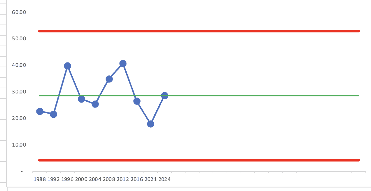
To me, the lesson is the same as we see in many business settings — stop reacting to (or trying to explain) every up and down in a business metric. Was 1996 “high” because those were the U.S.-based games in Atlanta? Maybe. But 2012 was just as high.
I’d use this chart to predict that the 2028 games’ number would fall between those red limits — between about 4 million and 52 million viewers. Yeah, that’s a huge range. But it’s based on the large point-to-point variation in the data over time. Unlike other TV ratings (like The Oscars), there doesn’t appear to be a definitive downward trend over time.
Applying This to Business Metrics
The same principle applies to business metrics. Suppose a company sees a spike in sales one month. Before celebrating a new “trend,” it’s essential to examine sales data over a longer period to understand if this is a genuine increase or just a fluctuation. Is the data point a statistical “signal” or is it “noise”?
In healthcare, for example, monitoring infection rates with PBCs can help determine if changes in rates are due to random variation or actual improvements in care processes. Showing that there’s a statistical signal, by the way, doesn’t prove a cause-and-effect relationship. In finance, investment performance needs to be evaluated over time to distinguish between normal market fluctuations and real growth.
In data analysis, more data points lead to more accurate trend identification. By using tools like run charts and PBCs, you can avoid the pitfalls of drawing conclusions from insufficient data.
How would you look at data like this?
Please feel free to comment or join the discussion on LinkedIn.
For more on metrics, charts, and making better decisions, please check out the free sample of my book Measures of Success.
What do you think? Please scroll down (or click) to post a comment. Or please share the post with your thoughts on LinkedIn – and follow me or connect with me there.
Did you like this post? Make sure you don’t miss a post or podcast — Subscribe to get notified about posts via email daily or weekly.
Check out my latest book, The Mistakes That Make Us: Cultivating a Culture of Learning and Innovation: